2025
MS.Future Skin Care Series
Entrant
Kelvin Wong
Category
Body, Health & Beauty - Skin Care
Client's Name
Country / Region:
China
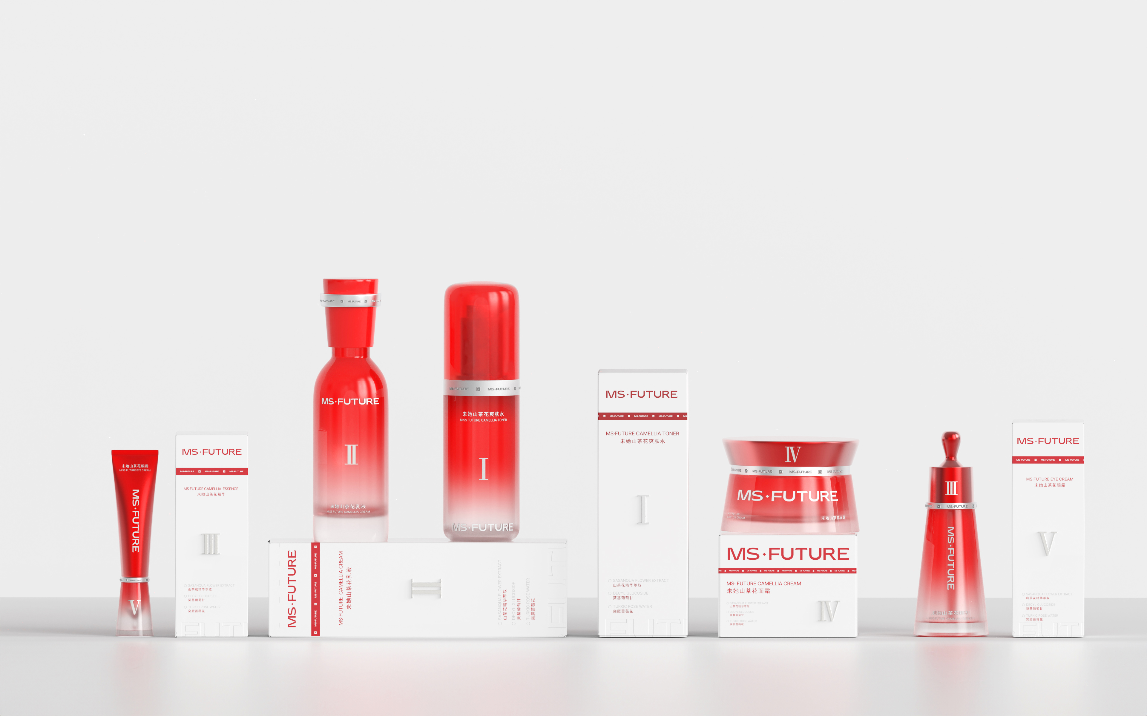
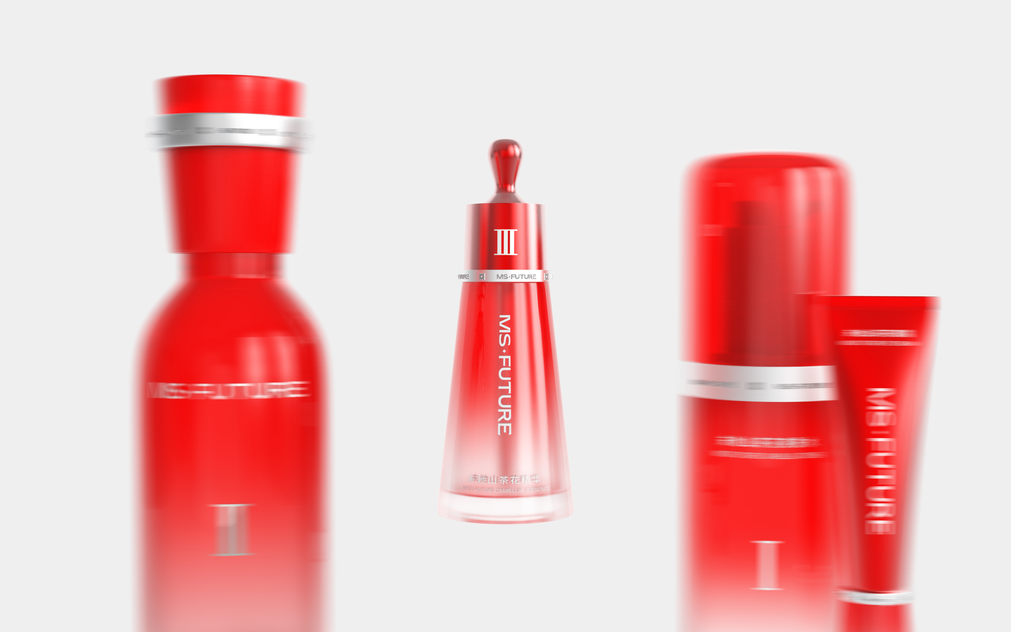
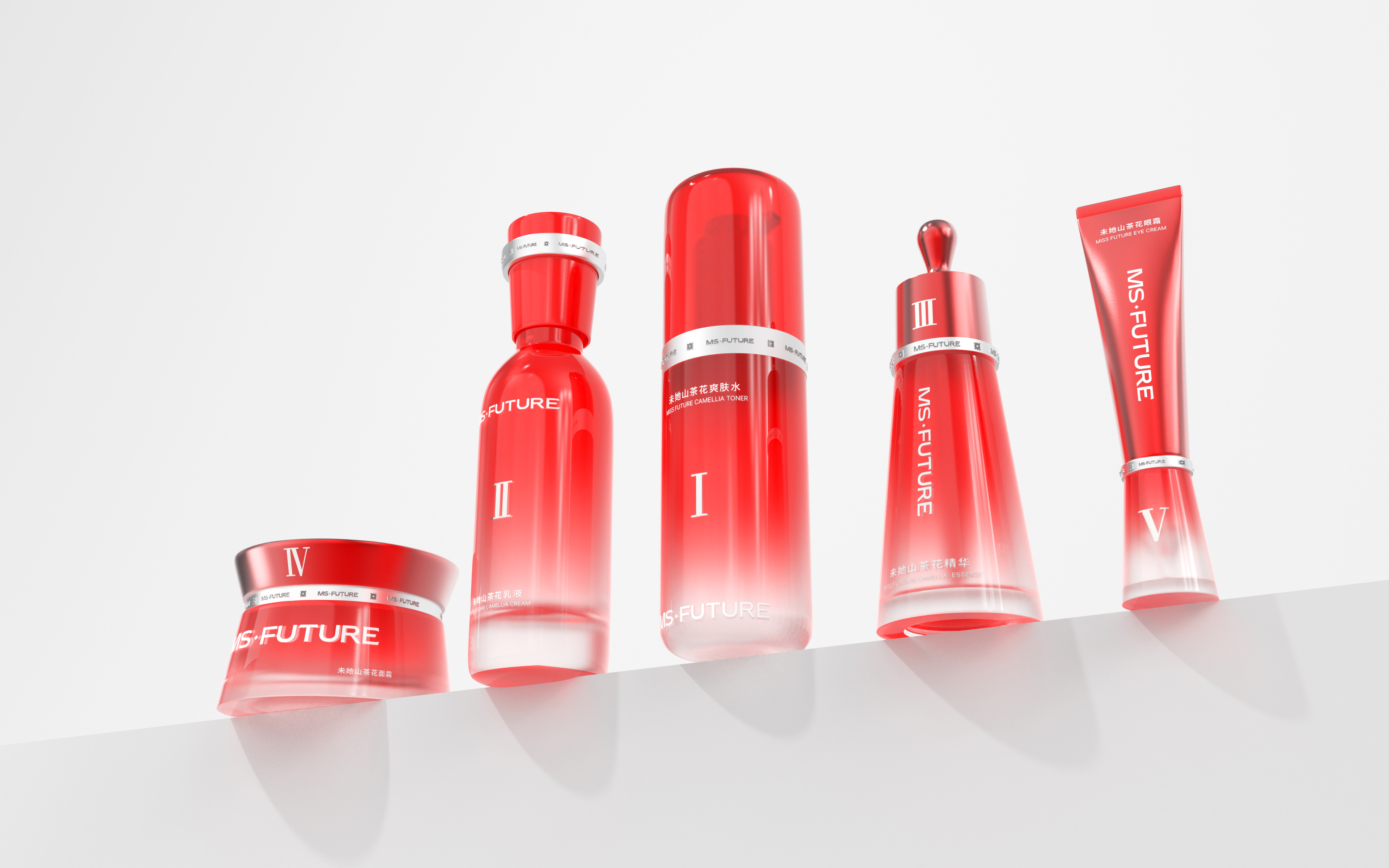
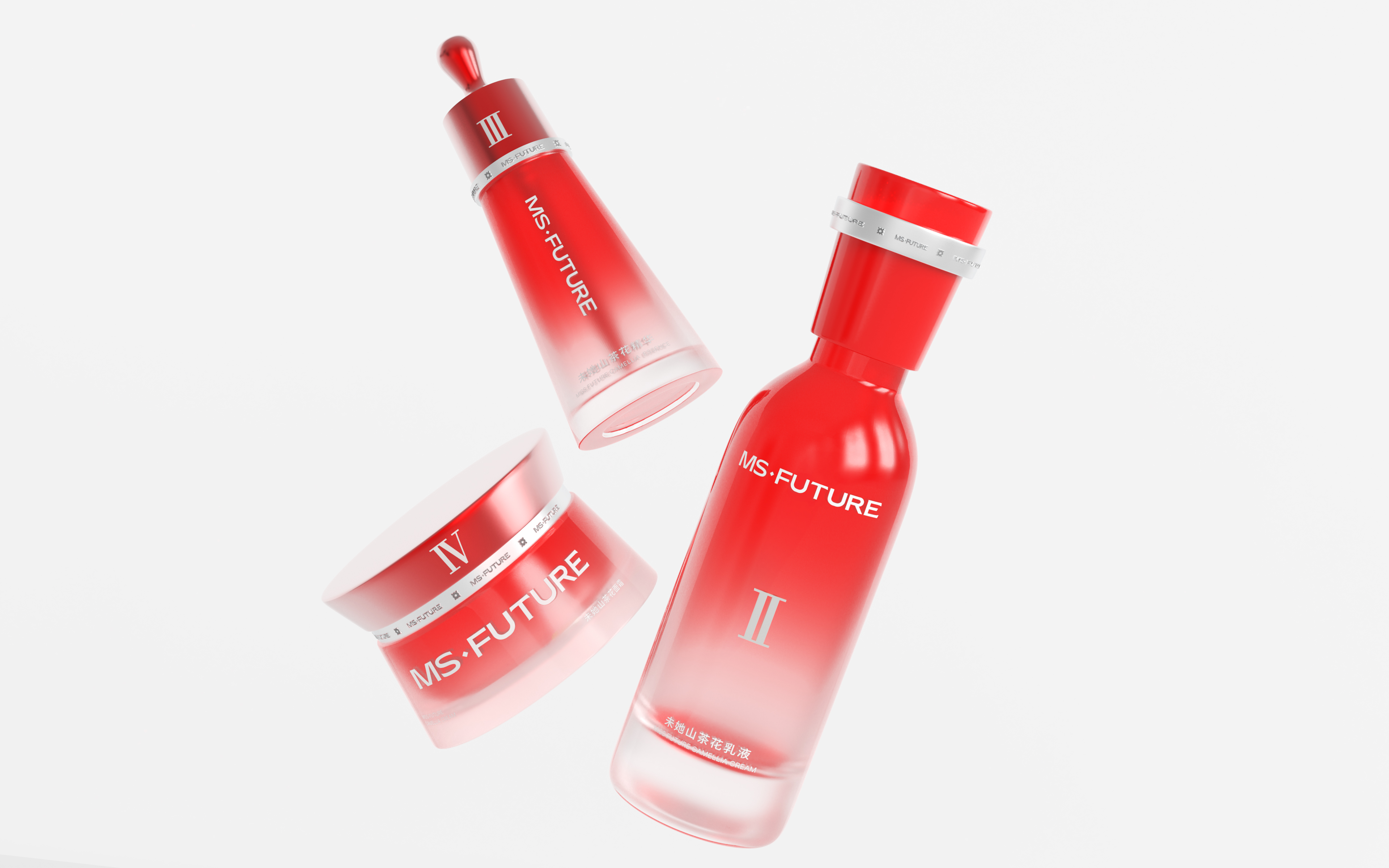
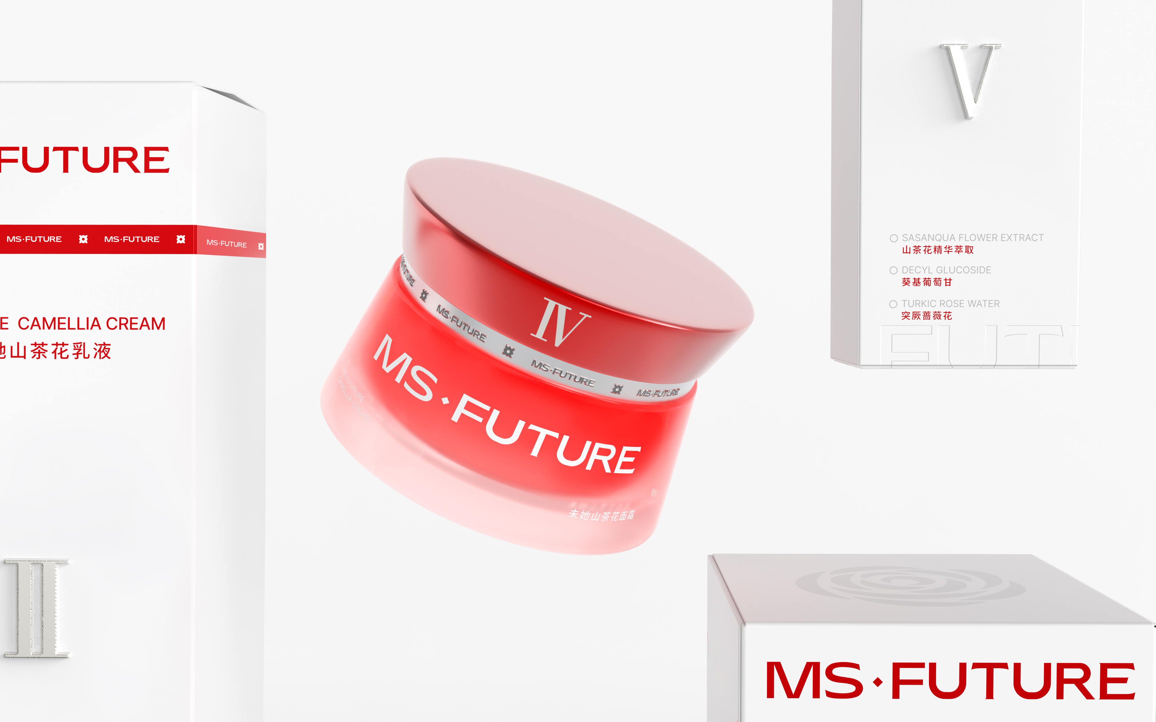
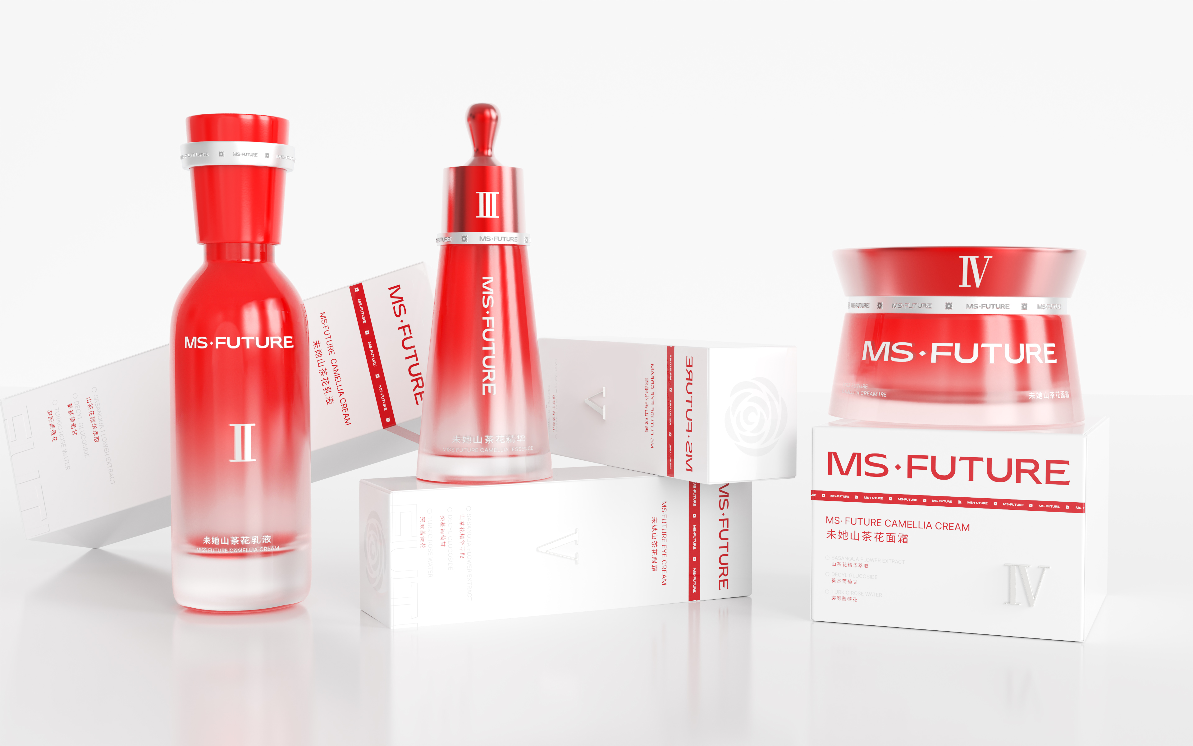
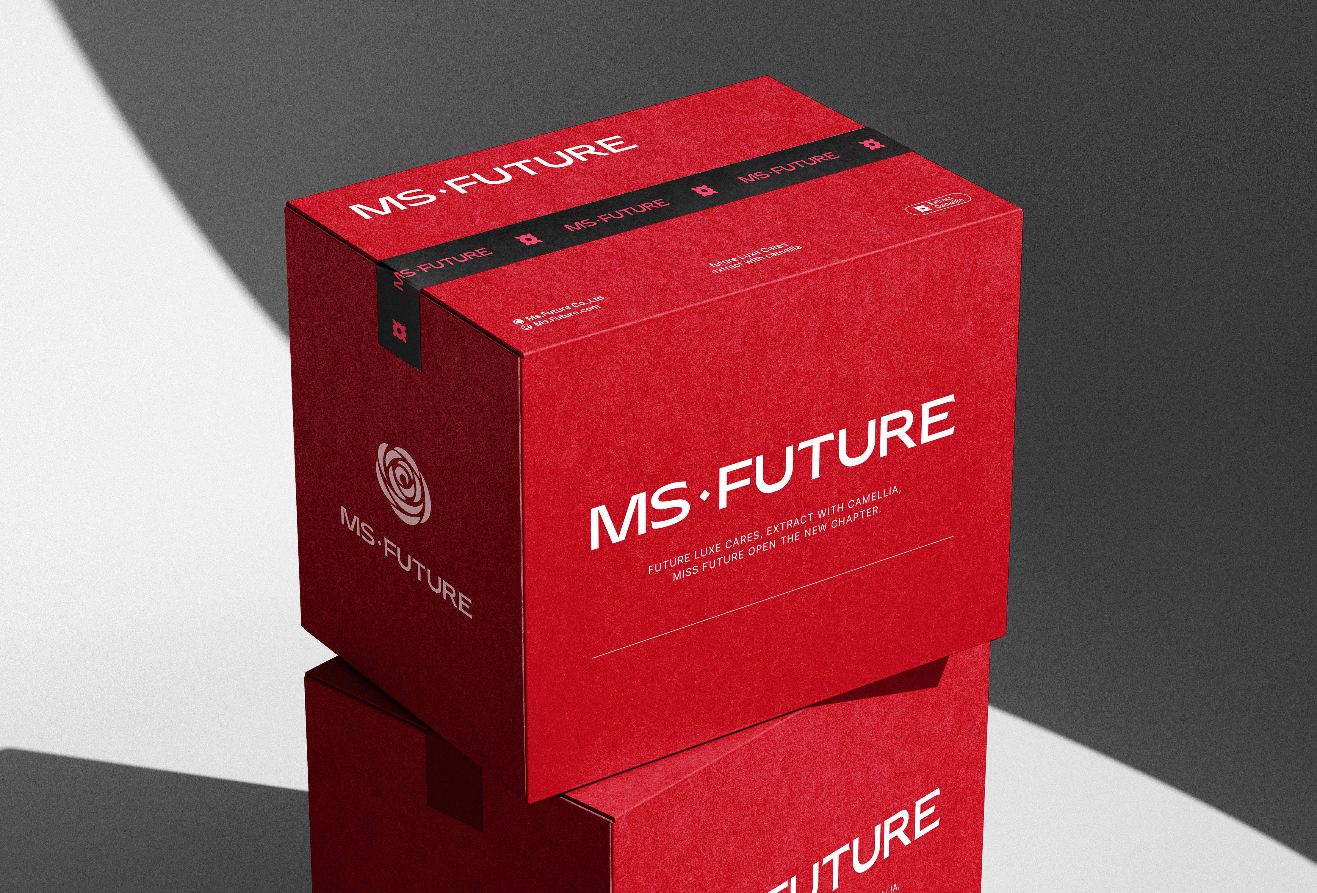
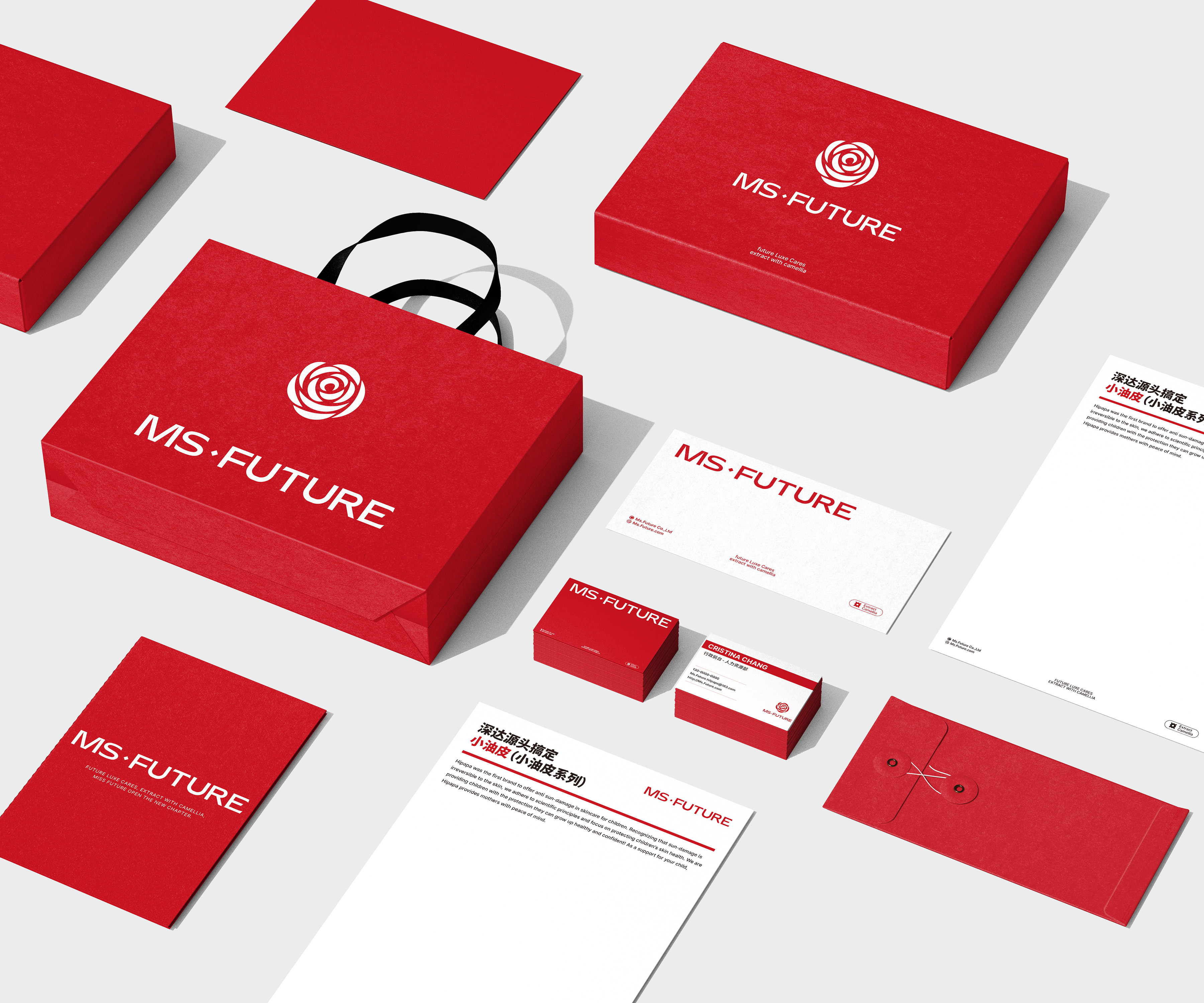
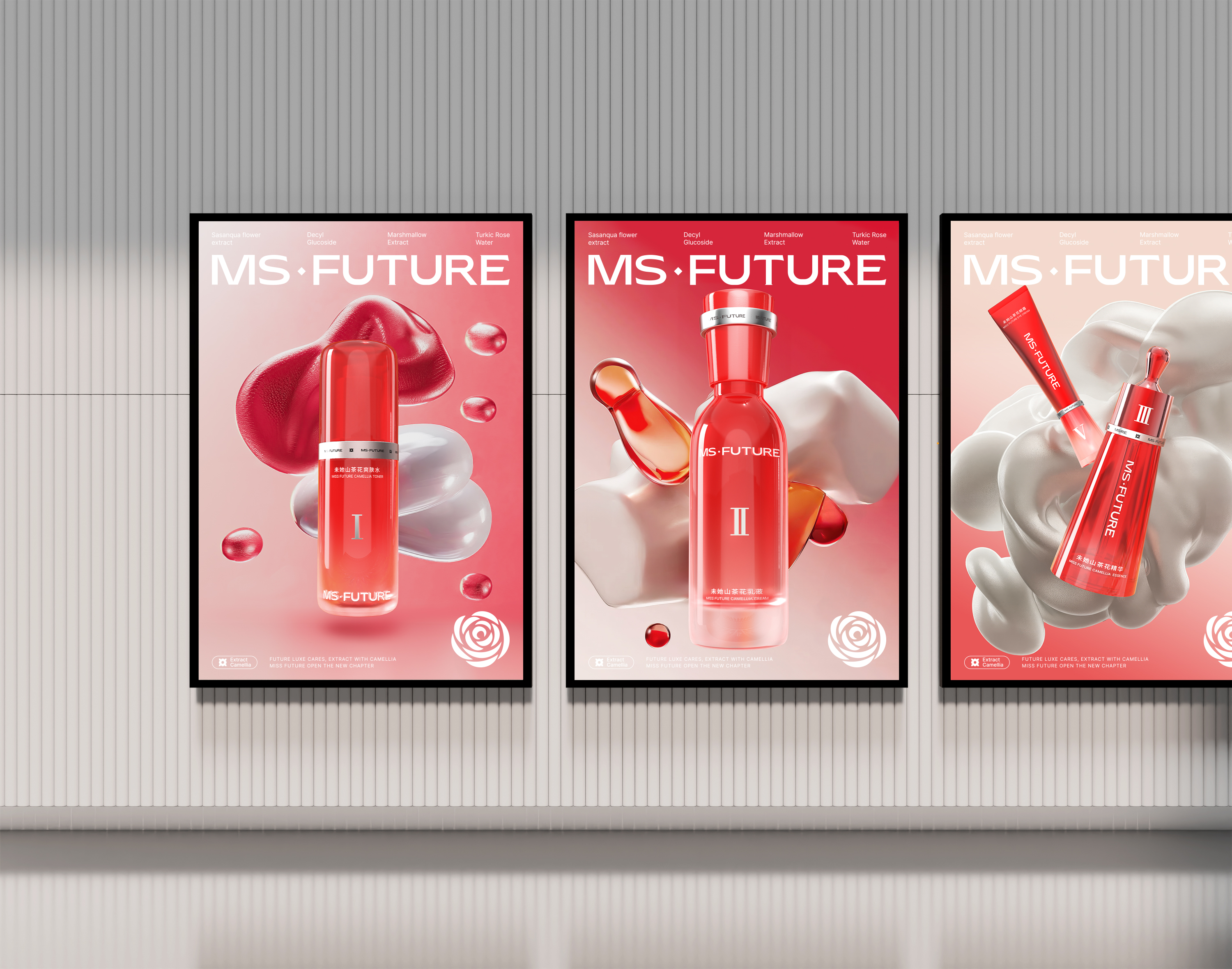
Designed for the MS.Future Skin Care Series, the innovative packaging combines visual appeal with practical utility by harmonizing color philosophy with functional aesthetics.
The design draws inspiration from the brand’s core natural camellia extract, using camellia’s vibrant red to show passion, energy, and restorative power. The red color highlights its botanical source and also represents the brand’s philosophy of drawing pure restorative power from nature, making each unboxing feel like a gentle touch of nature. Pure white is incorporated to balance the intensity of red, creating a soothing and harmonious visual effect while reinforcing a sense of technological sophistication. The bottles and tubes feature a red-to-transparent gradient, symbolizing the gradual penetration and restorative effect of the skincare ingredients. Silver-plated strips add a futuristic touch and visually echo the red strips on the outer box, symbolizing the flow of restorative power from one step of the routine to the next like an energy ring. The bottles and tubes are shaped in simple geometric forms—cylindrical or triangular—ensuring consistency across the series while conveying a stable and reliable product identity.
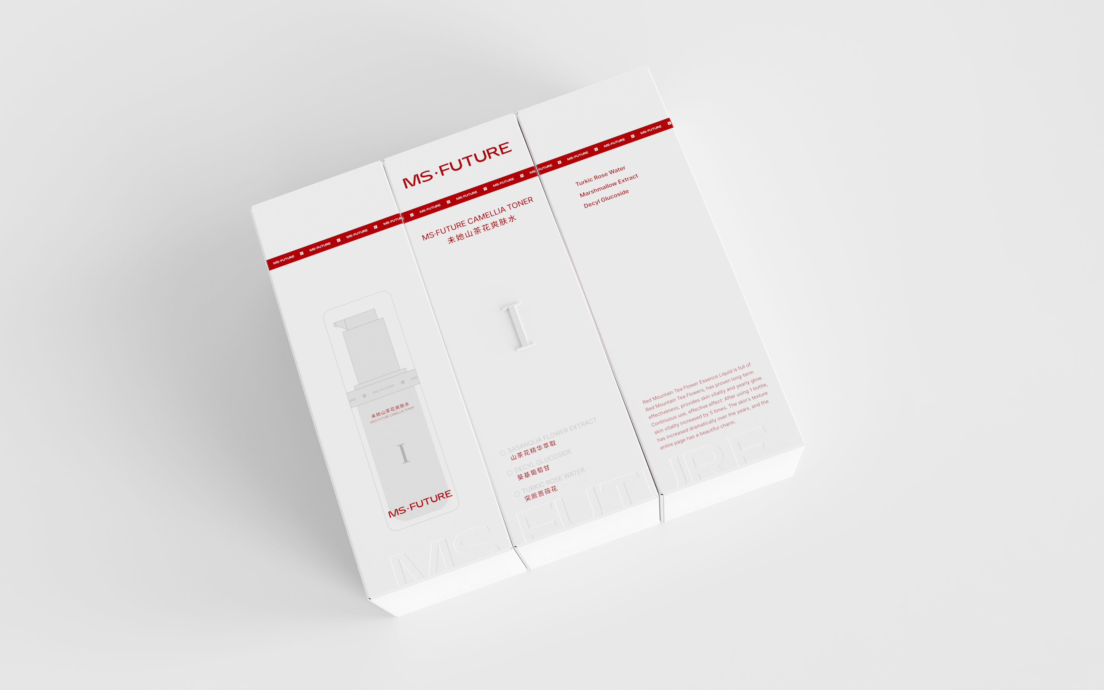
Thoughtful details enhance the user experience: The packaging features Roman numerals I-V to clearly indicate the recommended order of use. The outer box incorporates a specially designed modular feature—three boxes can be arranged together to form the full concave “MS Future” logo, adding interactive fun while boosting brand recognition.
Credits
Entrant
Shen Zhen Black White Grey Communication Technology Co., Ltd.
Category
Personal Care, Wellness & Beauty - Hair Straighteners
Country / Region
China
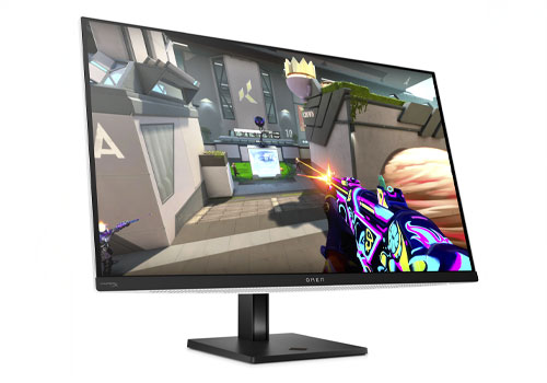
Entrant
HP Inc.
Category
Computer & Information Technology - Monitors
Country / Region
United States
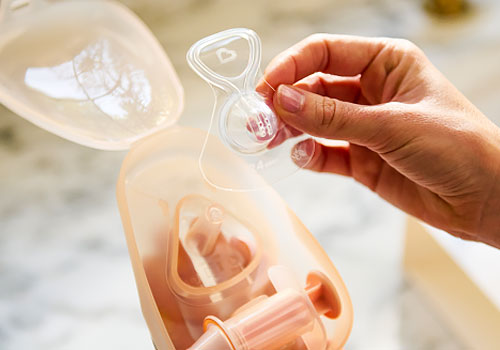
Entrant
WHY Brands
Category
Feeding - Breastfeeding
Country / Region
United States
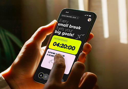
Entrant
Ai-Hsin Liu, Kylie Wang, Mengqi Li, Yu Zhuang, Savannah College of Art & Design
Category
User Experience (UX) - Product UX
Country / Region
United States