2026
Pure Harmony: The New Nature's Envy
Entrant
tofuStudio
Category
Body, Health & Beauty - Rebrand
Client's Name
Country / Region:
China
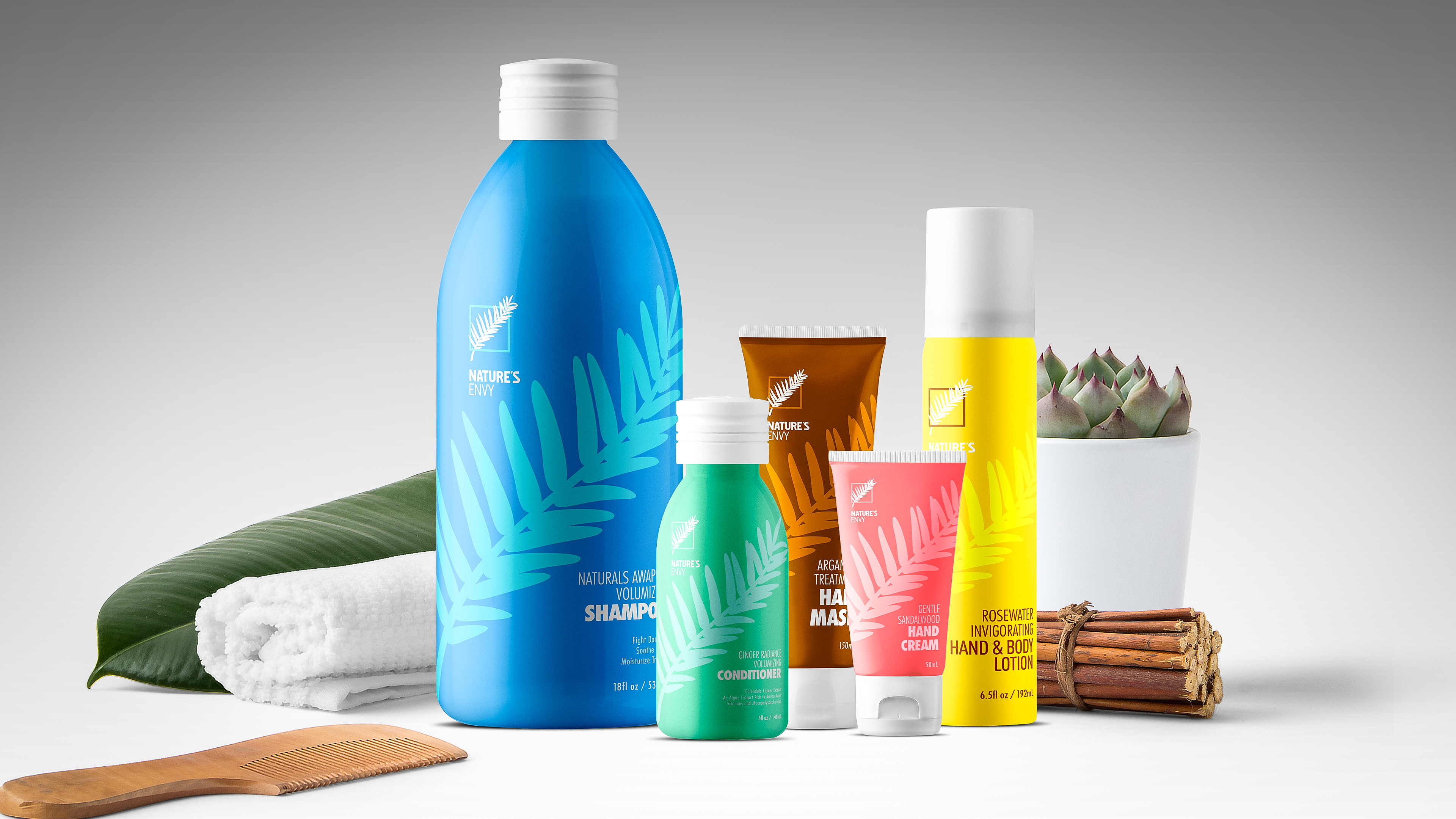
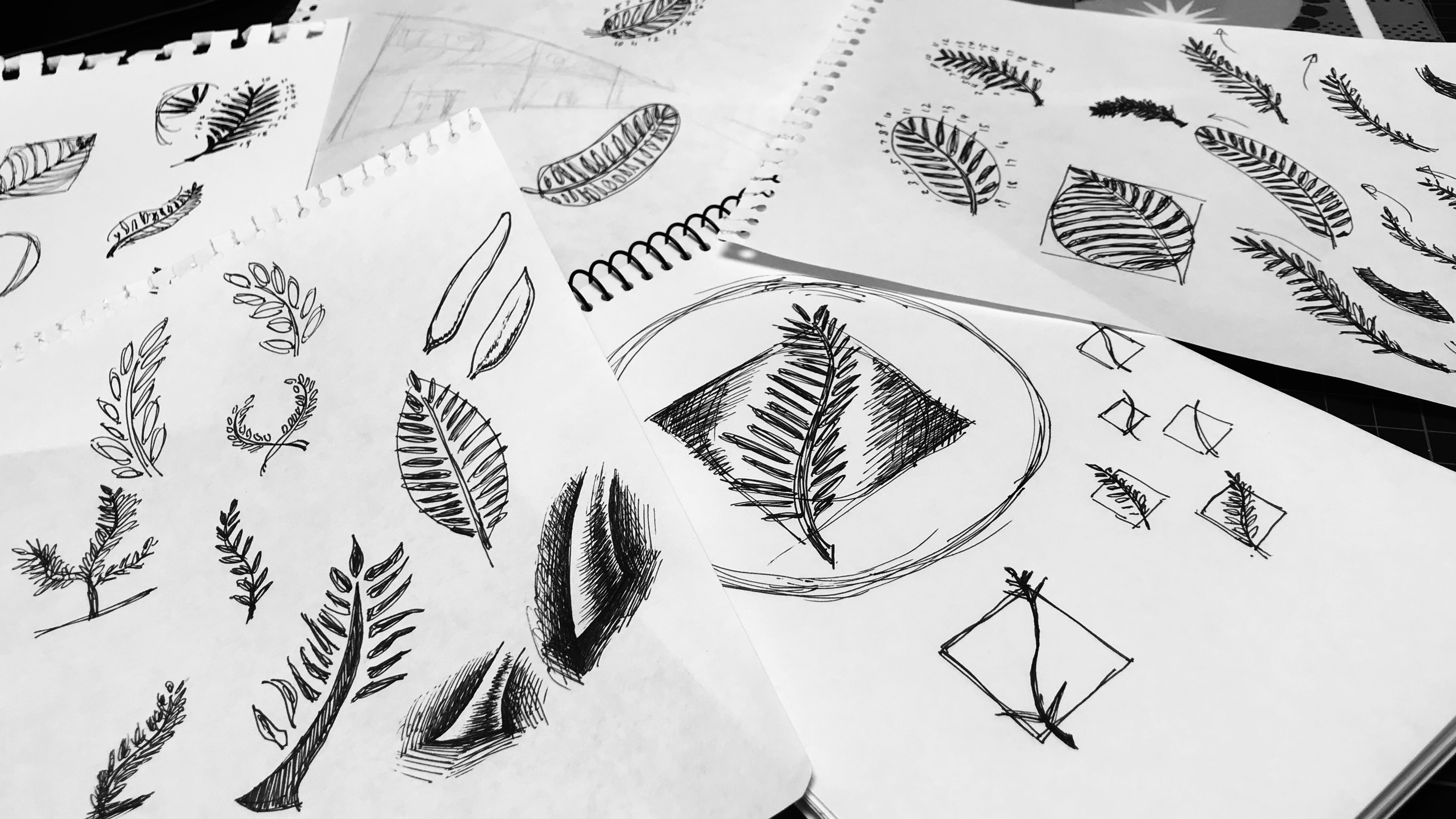
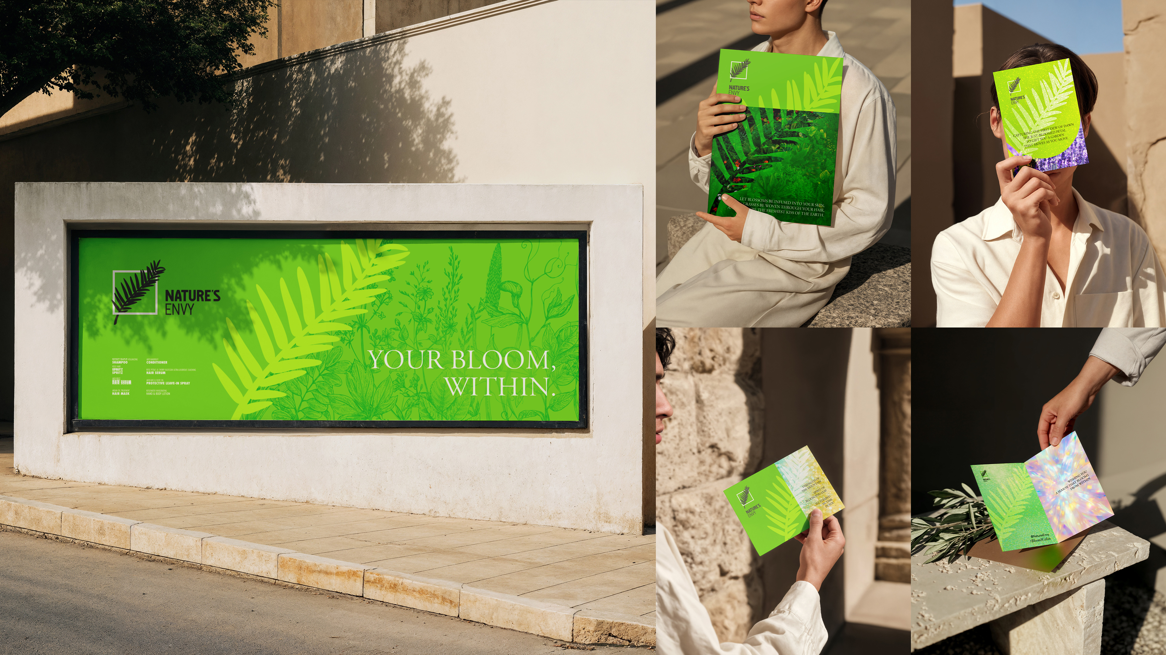
Since its inception, Nature’s Envy has remained dedicated to specialization in botanical efficacy, championing the dual philosophies of "Plant Power" and "Environmental Sustainability." However, as the product line expanded from hair care to full face and body care, the visual identity faced the challenge of fragmentation, gradually diluting these core values. For this rebranding project, the design team conducted in-depth research into the extracts of flowers, grasses, stems, and fruits from over forty plant species used in the formulations. Integrating these diverse elements, the project aims to construct a visual system that is both logically coherent and deeply emotionally resonant.
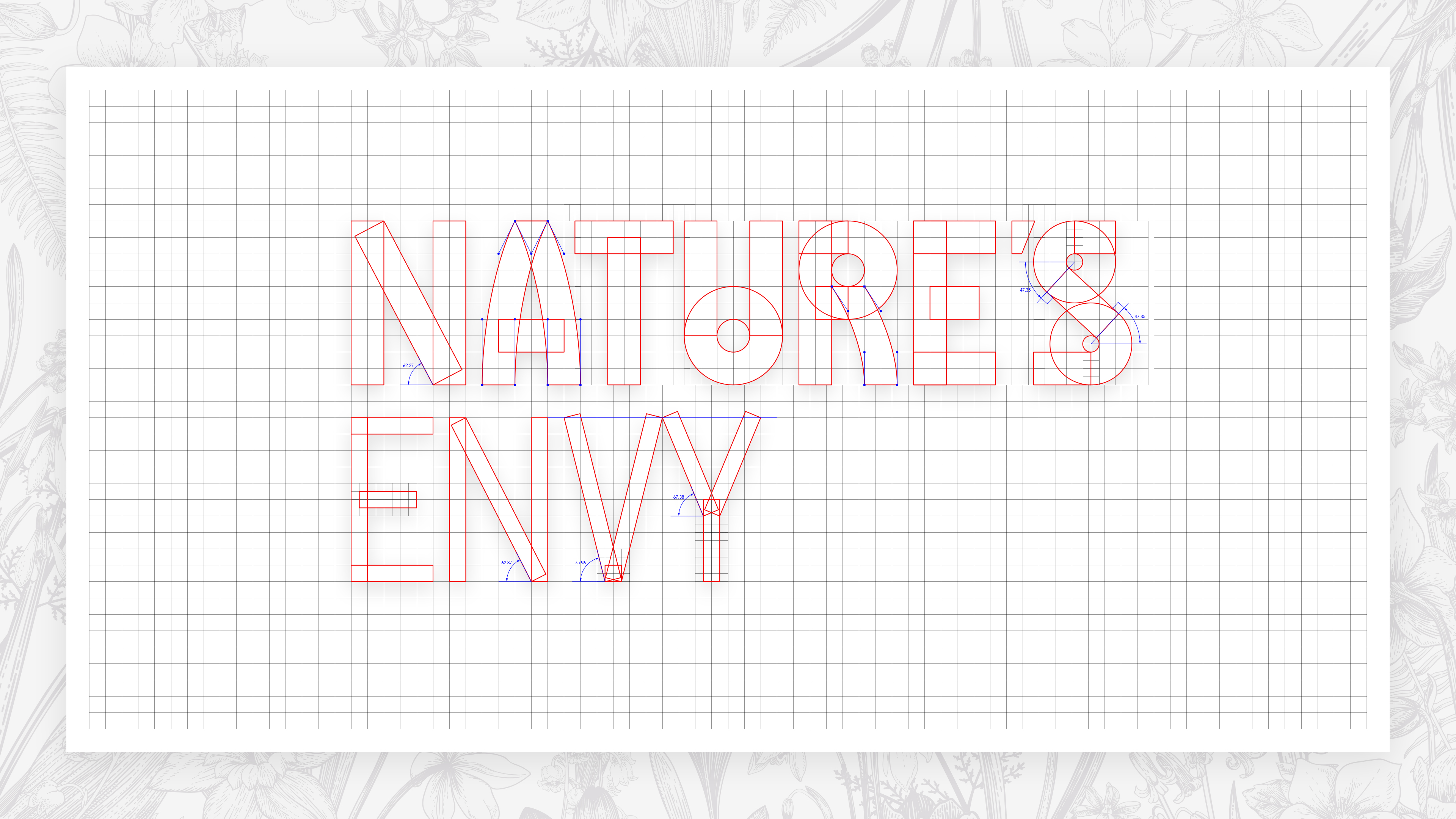
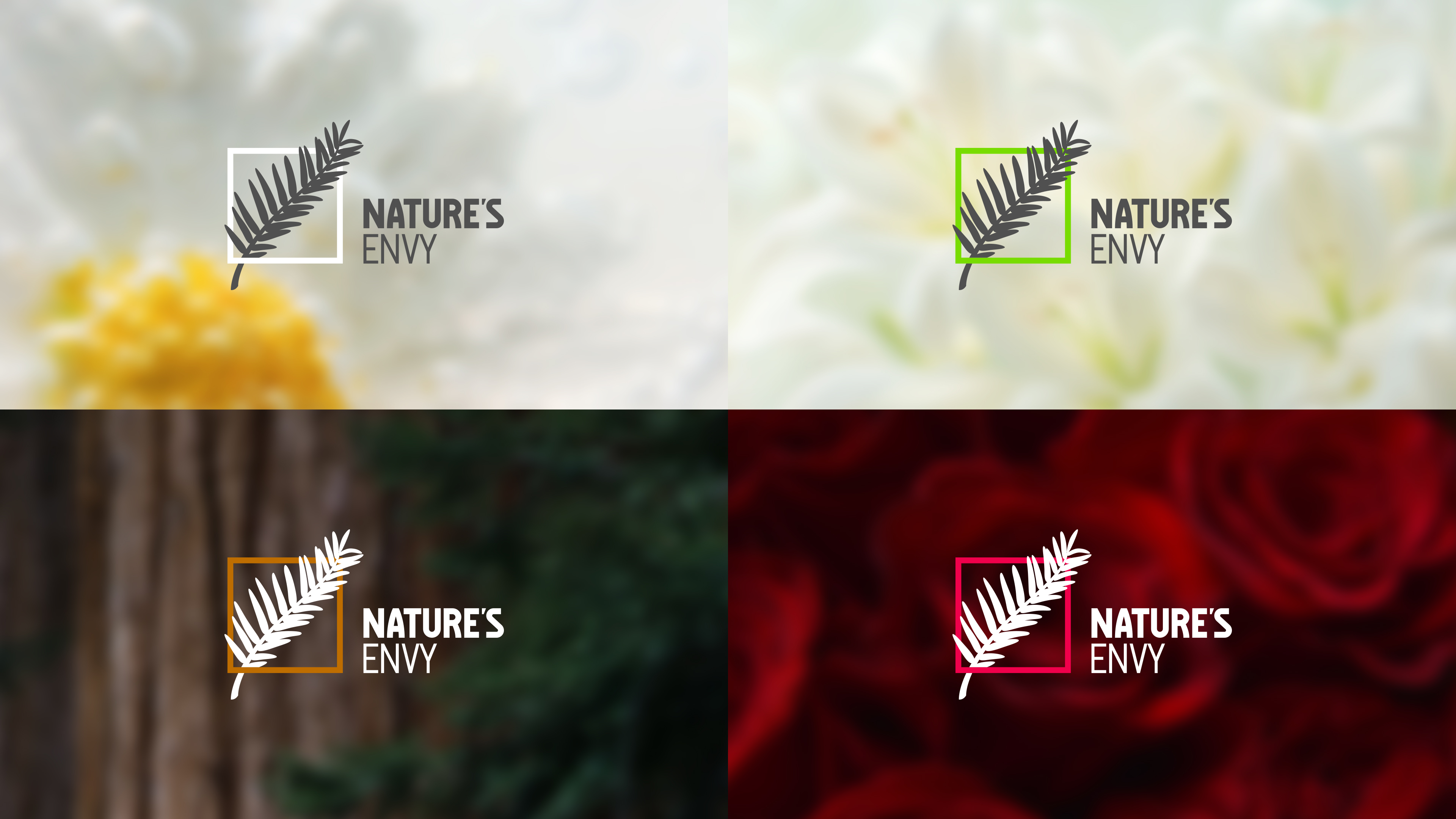
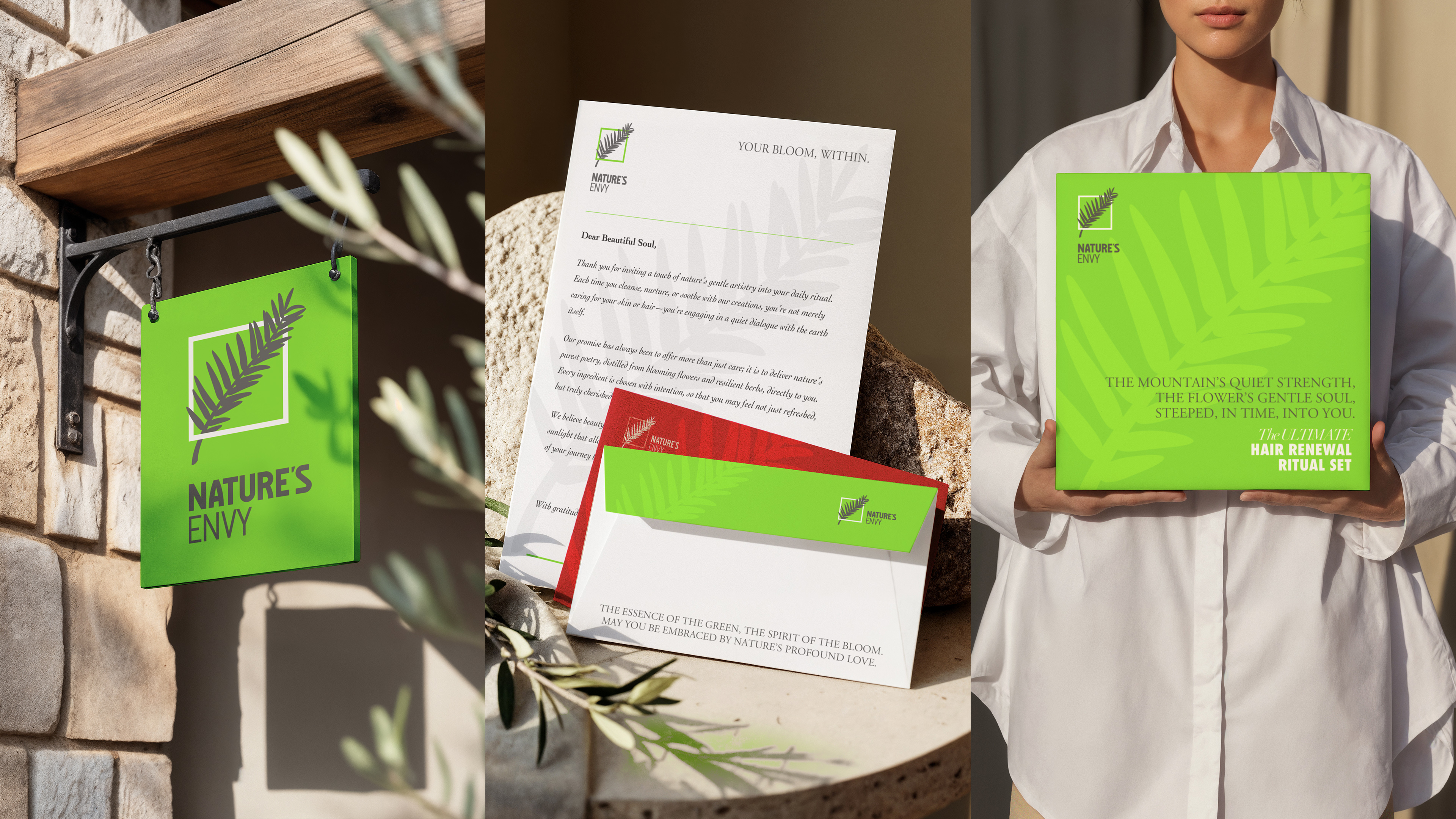
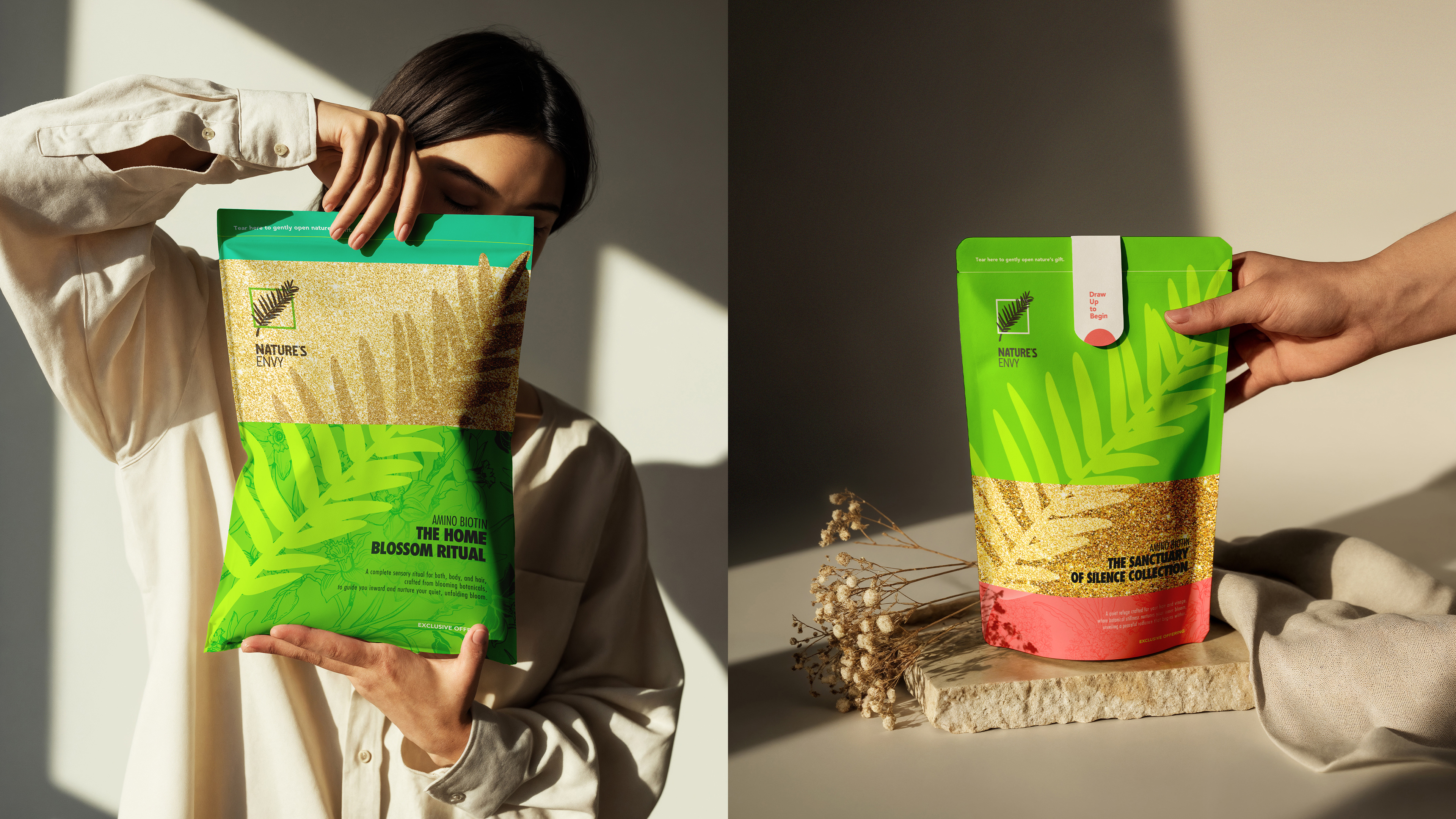
The core creative concept draws inspiration from "Old Tjikko," a 9,500-year-old spruce in Sweden recognized as the world’s oldest living tree. Its longevity stems from unique "self-repairing" capabilities, perfectly mirroring the "repair and nourishment" efficacy that drives the brand’s high repurchase rates. Consequently, the spruce leaf was established as the central visual symbol, representing resilience and the infinite cycle of nature. This concept is articulated through a deliberate color strategy: a vibrant "New Green" symbolizes continuous rebirth as the primary color for marketing recognition, anchored by "Graphite Grey" to represent eternal cycles.
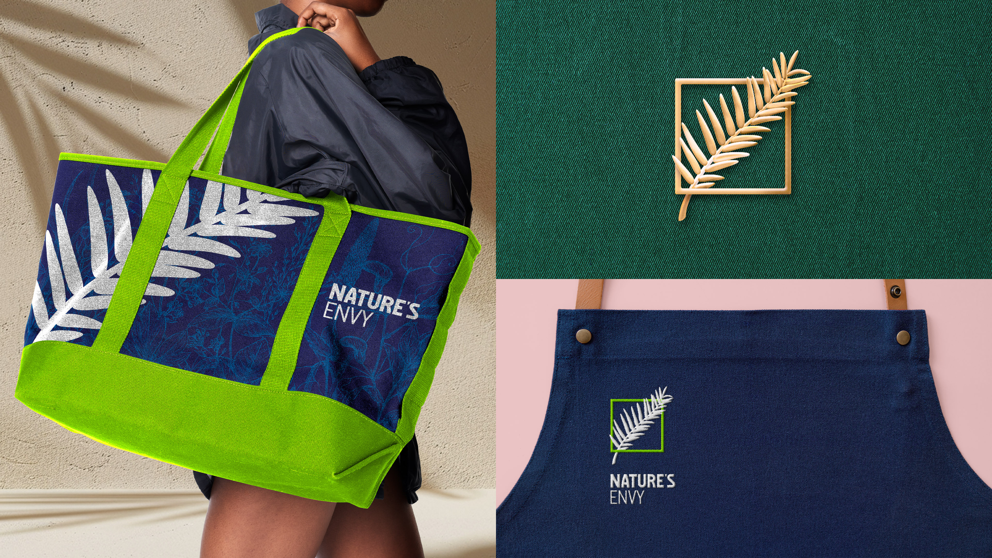
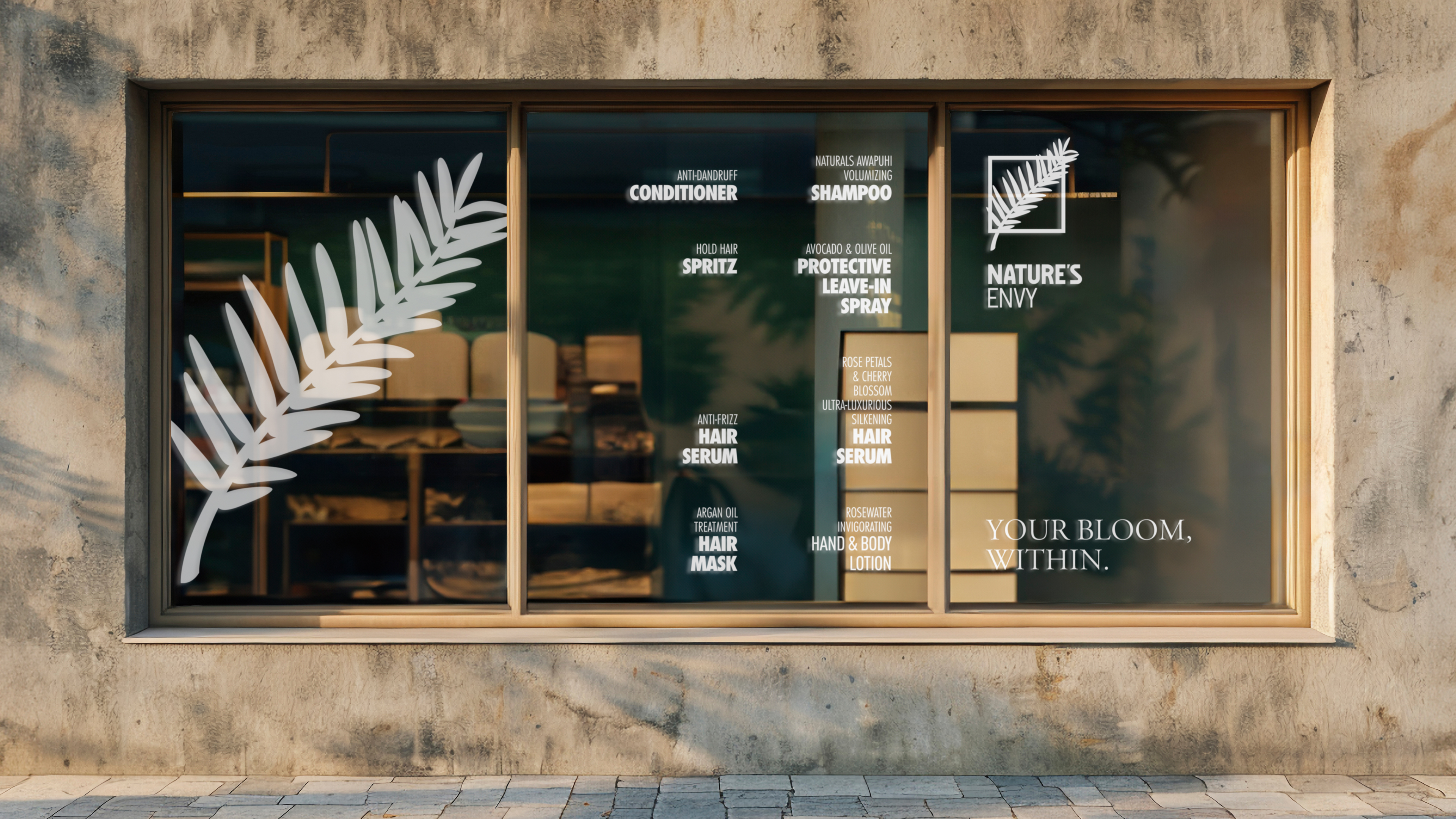
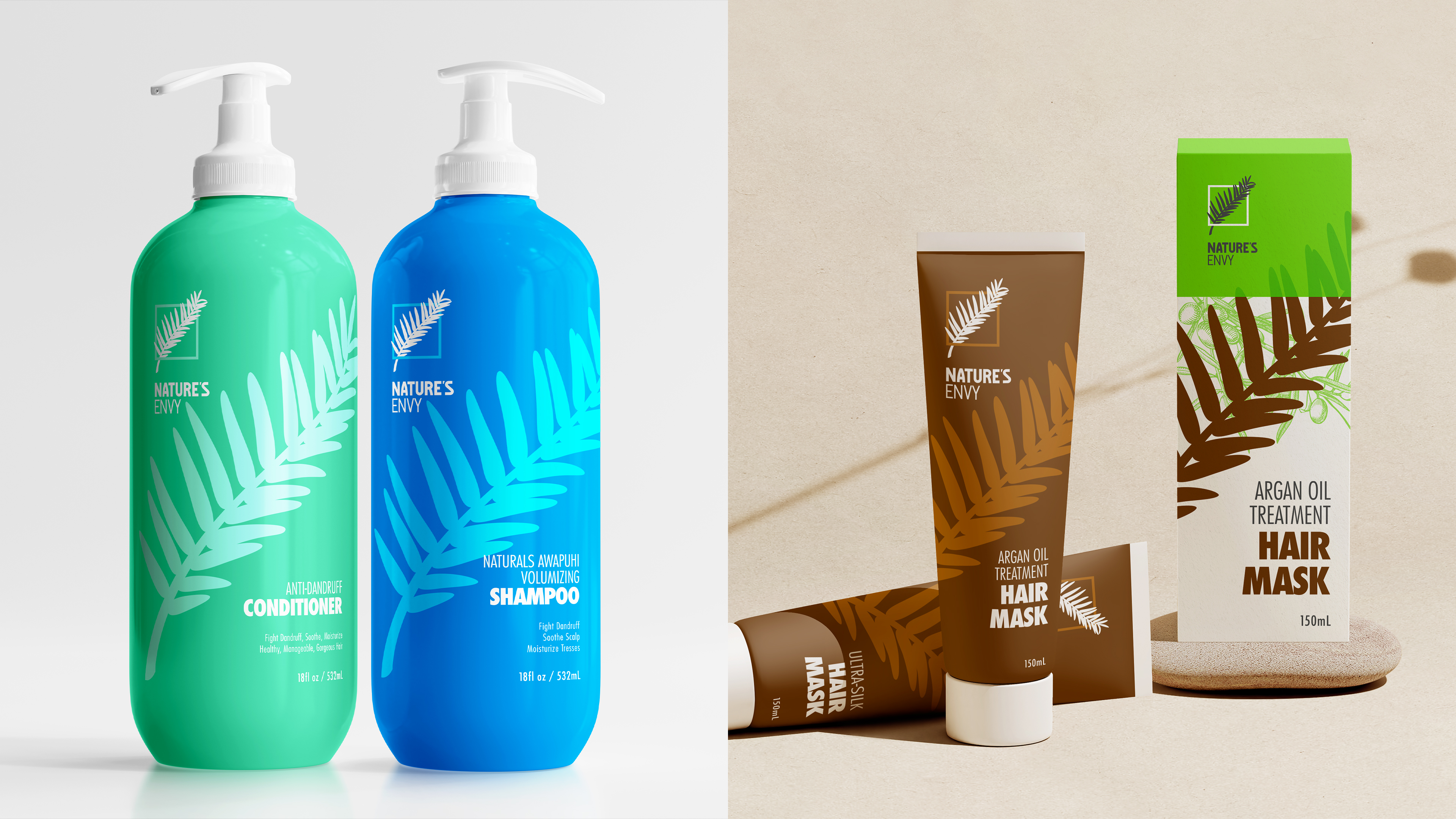
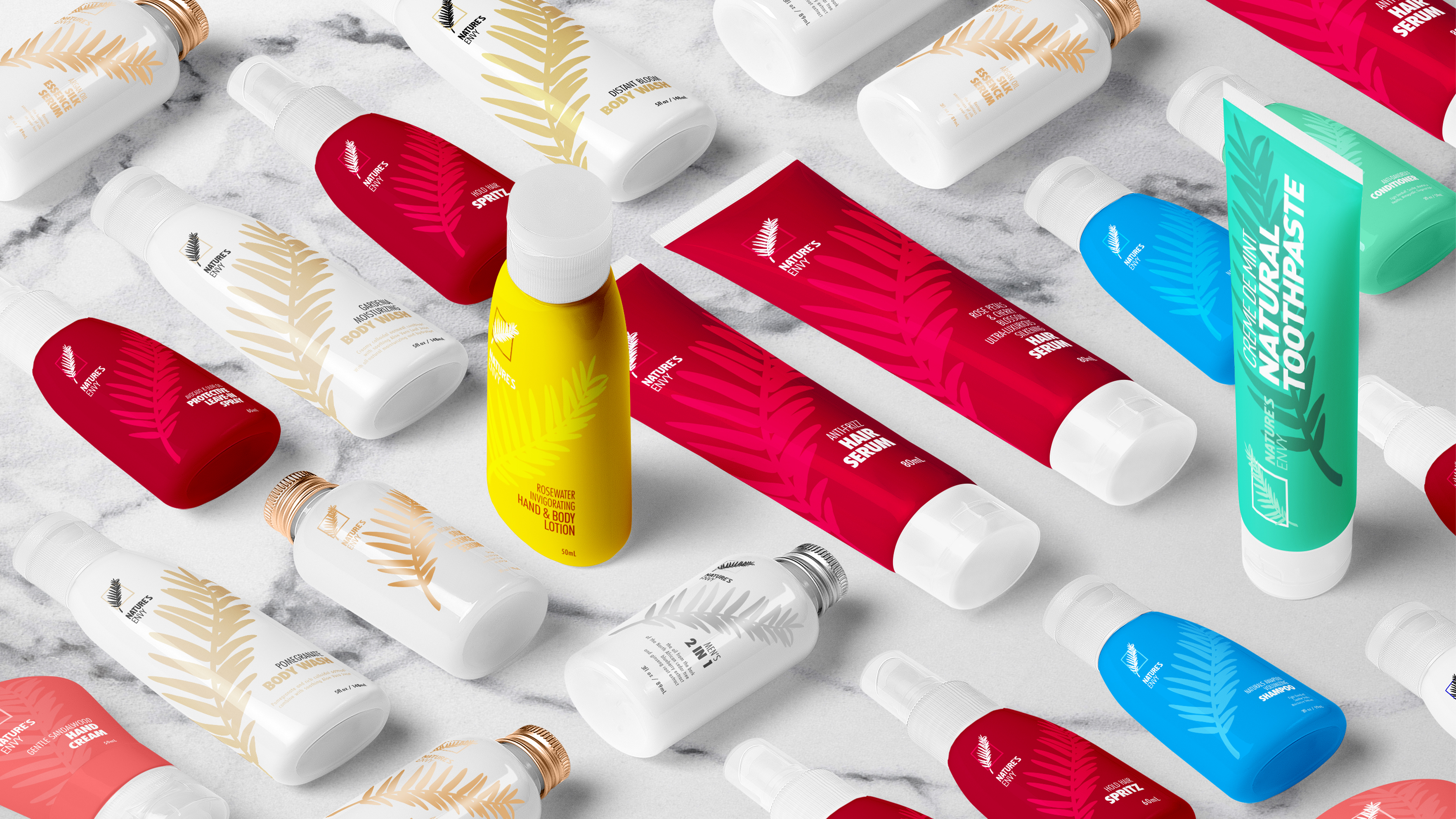
Functionally, the design resolves market confusion through a "Brand Face" strategy. We restructured the extensive SKU portfolio into a clear matrix: four anatomical categories (Head, Face, Limbs, Body) intersected with four functional dimensions (Wash, Care, Nourish, Style). While the "New Green" identity dominates marketing channels to build rapid brand recall, the physical packaging system utilizes a secondary, emotionally-driven auxiliary color palette tailored to specific product functions. This dual-system ensures that while the brand remains visually unified through consistent typography and layout, consumers can instantly distinguish between different product series.
Ultimately, this rebrand transcends simple aesthetic updates. By combining humanistic copywriting with a refined visual language, the new design vividly communicates "Care from Nature." It creates a perfect closed loop where the visual promise of "continuous renewal" meets the physical reality of "bodily repair," reinforcing the brand's commitment to eco-friendly, human-centric wellness.
Credits
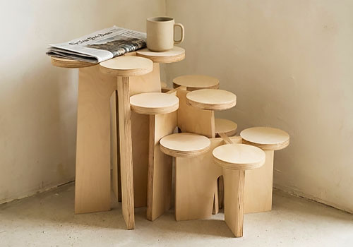
Entrant
Xubai Li
Category
Storage & Display Furniture - Tiered Display
Country / Region
United States
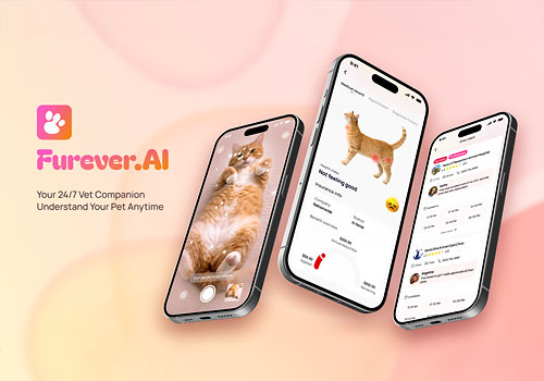
Entrant
Furever.AI
Category
User Experience (UX) - Product UX
Country / Region
United States
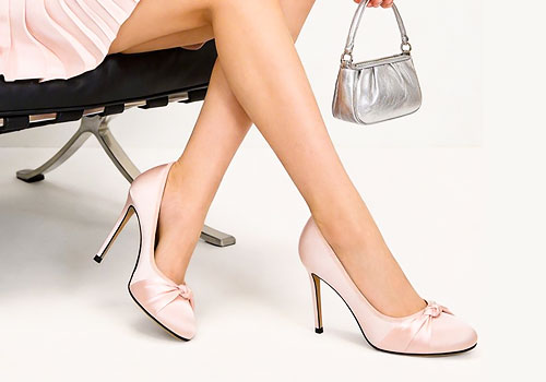
Entrant
LILYWEI
Category
Clothing & Accessories - Footwear
Country / Region
China
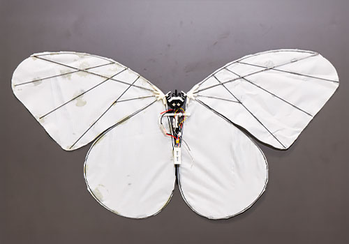
Entrant
Dora
Category
Trains & Planes - Flying Devices
Country / Region
China