
2026 Silver Winner
Home Interior
Counterpoint Salt & Pepper Mills
Entrant: Styled Settings
2026
Silver
A closer look
Project gallery.
Select a thumbnail to browse. Click the main image to enlarge.
CategoryHome Interior
Class / SubcategoryTableware
Salt & Spice Cellars
Salt & Spice Cellars
Country / Region United States
Client’s nameStyled Settings
Counterpoint is a collection of manual salt and pepper mills built on a single design gesture: inverse fluting.
The challenge. Salt and pepper mills are usually identical twins, told apart only by printed letters. We wanted a pair that reads as one object on the table, yet tells salt from pepper instantly, by sight or by touch.
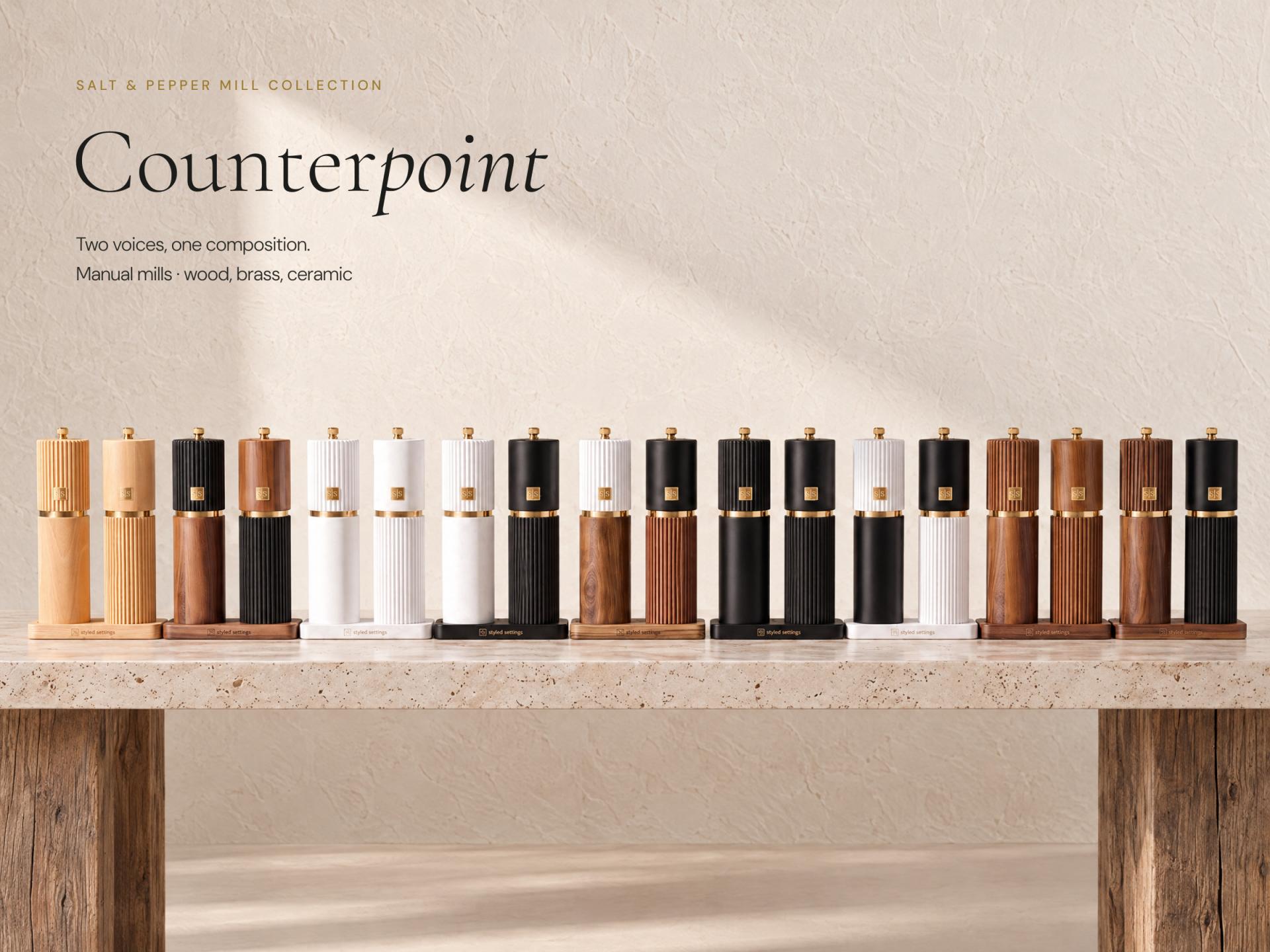
The idea. Fluting is Counterpoint's signature design language. Rather than applying it identically, the pair uses it in opposition: the salt mill has a fluted cap over a smooth body; the pepper mill reverses the relationship. Smooth below is salt. Fluted below is pepper. Side by side, the texture moves from one mill to the other like a musical counterpoint, unified by a slim gold collar and a gold plaque aligned on both caps. The difference can be read by sight or felt in the hand, an intuitive tactile cue that also supports users with visual impairments.
The detail. A brass adjustment screw at the crown, engraved S or P, provides an additional point of confirmation and sets the ceramic burr from fine to coarse. Keeping adjustment in that single detail leaves the body free of extra controls or markings. A concealed washer protects the finish through repeated use.
The process. Many concepts explored proportion, cap height, texture placement and the transition between upper and lower forms. The breakthrough came when fluting evolved from a formal detail into a functional language: one design decision that unified the pair visually and made it distinguishable by touch.
The form. Each mill stands almost 8.5 inches tall and just over 2 inches across, balanced for the hand and proportioned for the table. Made of wood, brass and ceramic, the pair rests on an engraved wooden stand that moves from countertop to tabletop.
The range. Every finish begins in wood: natural beech, warm acacia, or wood painted white or black, mixed across nine sets.
The result. One design gesture becomes both identity and function: a pair that feels coherent together and intuitive apart.
The challenge. Salt and pepper mills are usually identical twins, told apart only by printed letters. We wanted a pair that reads as one object on the table, yet tells salt from pepper instantly, by sight or by touch.
The idea. Fluting is Counterpoint's signature design language. Rather than applying it identically, the pair uses it in opposition: the salt mill has a fluted cap over a smooth body; the pepper mill reverses the relationship. Smooth below is salt. Fluted below is pepper. Side by side, the texture moves from one mill to the other like a musical counterpoint, unified by a slim gold collar and a gold plaque aligned on both caps. The difference can be read by sight or felt in the hand, an intuitive tactile cue that also supports users with visual impairments.
The detail. A brass adjustment screw at the crown, engraved S or P, provides an additional point of confirmation and sets the ceramic burr from fine to coarse. Keeping adjustment in that single detail leaves the body free of extra controls or markings. A concealed washer protects the finish through repeated use.
The process. Many concepts explored proportion, cap height, texture placement and the transition between upper and lower forms. The breakthrough came when fluting evolved from a formal detail into a functional language: one design decision that unified the pair visually and made it distinguishable by touch.
The form. Each mill stands almost 8.5 inches tall and just over 2 inches across, balanced for the hand and proportioned for the table. Made of wood, brass and ceramic, the pair rests on an engraved wooden stand that moves from countertop to tabletop.
The range. Every finish begins in wood: natural beech, warm acacia, or wood painted white or black, mixed across nine sets.
The result. One design gesture becomes both identity and function: a pair that feels coherent together and intuitive apart.
Project credits.
Aneta Winiarski
Creative Director & Concept Lead, Styled Settings
Joseph Mercurio
Industrial Designer
Mister Mister Studios
Photography
Keep exploring
More winning perspectives.
2026 Silver Winner
Hi!papa All-School-Age Stage Skincare Series
Guangzhouhaigui Papa Biotechnology Co.,Ltd.2026 Silver Winner
Jian Mu
Changzhou Turas E-commerce Co., LtdYour work belongs in the conversation.
Begin Your Entry